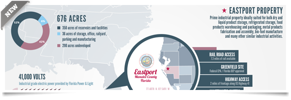
The
power of information cannot be neglected in today’s world. However, converting
information into knowledge, that is equally easily understandable and
recallable, it takes good deal of time and energy. When it comes to hefty
information, it is not only hard to assimilate but also hard to memorize.
Therefore, with infographic design, you can easily break information into
snippets.
This
makes things a whole lot easier. Not only can you save your audience from
information overload but also help them understand with easy visualization.
Infographic designs are designed with considerate soundness, accuracy and
comprehension. Infographic designers take into account several factors for
information to become useful including right color coding, appealing graphics,
content with right frames and statistics. To accommodate all of these
considerations in such a manner that no information snippet gets lost in the
process is a daunting task. However, here, I am presenting five pivotal tactics
to have powerful infographic submission.
1.
Use Flow Charts:
The hefty data in the organizations, hospitals, households,
businesses etc are usually complex in nature. Therefore, use of flow charts
like bar diagrams, pie charts etc can be highly beneficial. Group all the
relevant data and design a chart out of it will convert words into picture in
an articulate manner.
2.
Choose The Right Colors And Patterns:
The
smart choice of color in an infographic design works as magic potion.
Therefore, to keep your readers’ attention to infographic information, choose
colors wisely so their attention may not get scattered all over the place.
Avoid using extremely highlighting neon colors and light colors because it
makes information illegible.
3.
Check Your Theme And Reference
Attributes:
Choose
the right theme and correct reference attributes. Your infographic theme will
tell the reader in a glance about what you actually wish them to know. On the
other hand, reference attributes are icons and symbols to add to your
presentation. The use of reference attributes is highly recommended if you have
large information to present while wanting to keep infographic clutter-free.
4.
Do Thorough Research:
Before
you jot down points on the infographic, run a thorough research over available
material. Use facts and figures rather than intuition and thoughts. Consider
the demographics of your readers and audience and target them accordingly. If
your audience comprises of professionals, do not use colorful fonts and
unnecessary images.
5.
Connect Your Information With The
Topic:
Once
you know your demographic, it is advised that you connect the infographic
design to the topic as well. If you want to raise awareness on child labor, do
not present it in subtle daffodil shade. This shade is linked with joy and
happiness which comes in contradiction with your topic.
Thus, you cannot neglect the power of information that is
understandable, recallable, and sufficient. Whether you are a marketing manager
at a small or medium sized enterprise or at an industry giant, you need to
remember that your infographic can be as simple as you want or as complex as
you wish. The correct decision can b made on the five tactics discussed above
and this will decide how powerful your infographic submission can be.


